UI Design
UIs for jamovi analyses are defined in the .u.yaml file (A refresher on the files and the relationship between them is described here). This describes what sort of control each option is represented by (i.e. a dropdown list, or some radio buttons), and the order and the layout in which they will appear.
aggressive vs tame compiler mode
When you first create an analysis, jamovi manages the .u.yaml file for you. This behavior is controlled by the compilerMode property:
aggressive(Default): Think of this as “Auto-Pilot.” Every time you runjmvtools::install(), jamovi completely regenerates the UI file based on youra.yamloptions. This is perfect when you are still adding or removing options, as it ensures the UI always matches your code. Note: Any manual changes you make to the.u.yamlwill be overwritten in this mode.tame: Think of this as “Manual Control.” Once you start fine-tuning the layout (e.g., grouping checkboxes, adding custom labels, or adjusting margins), you should switch totamemode. In this mode,jmvtoolswill respect your manual edits and only add new options if it can find a safe place for them.
Tip
Start Aggressive, Stay Tame.
Use aggressive mode while you are defining your analysis’s core features. Switch to tame only when you are ready to “polish” the visual layout.
UI Best Practices Checklist
To ensure your analysis feels like a native part of jamovi, follow these design principles:
- Group Related Options: Use
LayoutBoxorCollapseBoxto group related checkboxes (e.g., “Assumption Checks” or “Additional Statistics”). - Use Standard Margins: Apply
margin: largeto top-levelLayoutBoxelements to give the UI room to breathe. - Order by Importance: Place the most critical inputs (like variable selection) at the top.
- Label Clearly: Use sentence-case for labels (e.g., “Assume equal variances” instead of “Assume Equal Variances”). Use title-case for group titles and variable boxes (i.e. Fixed Factors).
- Avoid Clutter: If an analysis has many advanced options, hide them inside a
CollapseBoxthat is closed by default. - Avoid Verbs (except in push buttons): Checkbox labels should describe what they enable, not what jamovi will do. Prefer ✅ Residual plot over ❌ Show residual plot.
- Do as jamovi does: Try and be consistent with the analyses bundled with jamovi.
Controls
As we’ve seen earlier in this tutorial series with our t-test example, each option is represented by one or more controls. Our list option was represented by a list box, boolean options were represented by checkboxes, and Variable options were represented as a box that variables could be dragged to.
Let’s take a look at UI, and the .u.yaml file which is responsible for it:
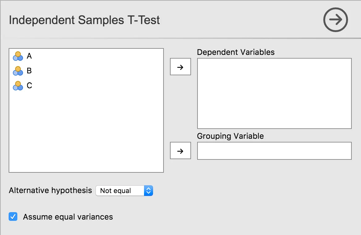
title: Independent Samples T-Test
name: ttestIS
jus: '3.0'
stage: 0
compilerMode: aggressive

children:

  - type: VariableSupplier
    persistentItems: false
    stretchFactor: 1
    children:

      - type: TargetLayoutBox
        label: Dependent Variables
        children:
          - type: VariablesListBox
            name: deps
            isTarget: true

      - type: TargetLayoutBox
        label: Grouping Variable
        children:
          - type: VariablesListBox
            name: group
            maxItemCount: 1
            isTarget: true

  - type: LayoutBox
    margin: large
    children:
      - type: ComboBox
        name: alt

  - type: LayoutBox
    margin: large
    children:
      - type: CheckBox
        name: varEq
As can be seen, controls are arranged in a hierarchy. At the very top is a control of type VariableSupplier. It has two children: deps of type VariablesListBox and group of type VariableListBox. Together, these three controls create the variables list, and the ‘Dependent Variables’ and ‘Grouping Variable’ drop targets.
Next is a LayoutBox which contains the hypothesis ComboBox, followed by another LayoutBox containing the equality of variances CheckBox. By default, items are laid out in a grid from top to bottom.
Layout and Grouping
You can control how items are arranged using the style property of a LayoutBox:
list(default): Children are arranged vertically.inline: Children are arranged horizontally.
To add a heading or a custom label to a group of controls, you can use a Label control or wrap controls in a LayoutBox with a label property (like a CollapseBox).
For more advanced layouts, you can use the cell property on child controls to place them in a specific grid position within a LayoutBox.
See the LayoutBox and CollapseBox documentation for more details.
Next Step: Take your UI further with Advanced UI Design.